Color isn't just about making your thumbnail look pretty – it's a powerful psychological tool that can influence emotions, create associations, and drive viewer behavior. When used strategically, color theory can be the difference between a thumbnail that gets scrolled past and one that gets clicked.
In this comprehensive guide, we'll explore the science behind color psychology, analyze successful YouTube thumbnails across different niches, and provide you with actionable strategies to choose the perfect color schemes for your content.
Quick Win Strategy
Before diving deep, here's an instant improvement: Use colors that contrast with YouTube's white and dark gray interface. Bright oranges, vibrant purples, and electric blues perform 40% better than muted tones.
Understanding Color Psychology
Every color triggers specific emotional responses and associations in the human brain. These responses are both universal (based on evolutionary biology) and cultural (learned through society). For YouTube thumbnails, understanding these responses helps you choose colors that align with your content's emotional tone.
Red
Energy, urgency, passion, danger. Perfect for action content, alerts, and emotional topics.
Orange
Enthusiasm, creativity, fun, warmth. Excellent for entertainment and tutorial content.
Yellow
Optimism, happiness, attention, caution. Great for educational and positive lifestyle content.
Test Your Color Choices!
Upload your thumbnails to see how different color schemes perform. Our AI analyzes color psychology impact and suggests optimal combinations for your niche.
Analyze Color ImpactThe 5 Essential Color Harmony Rules
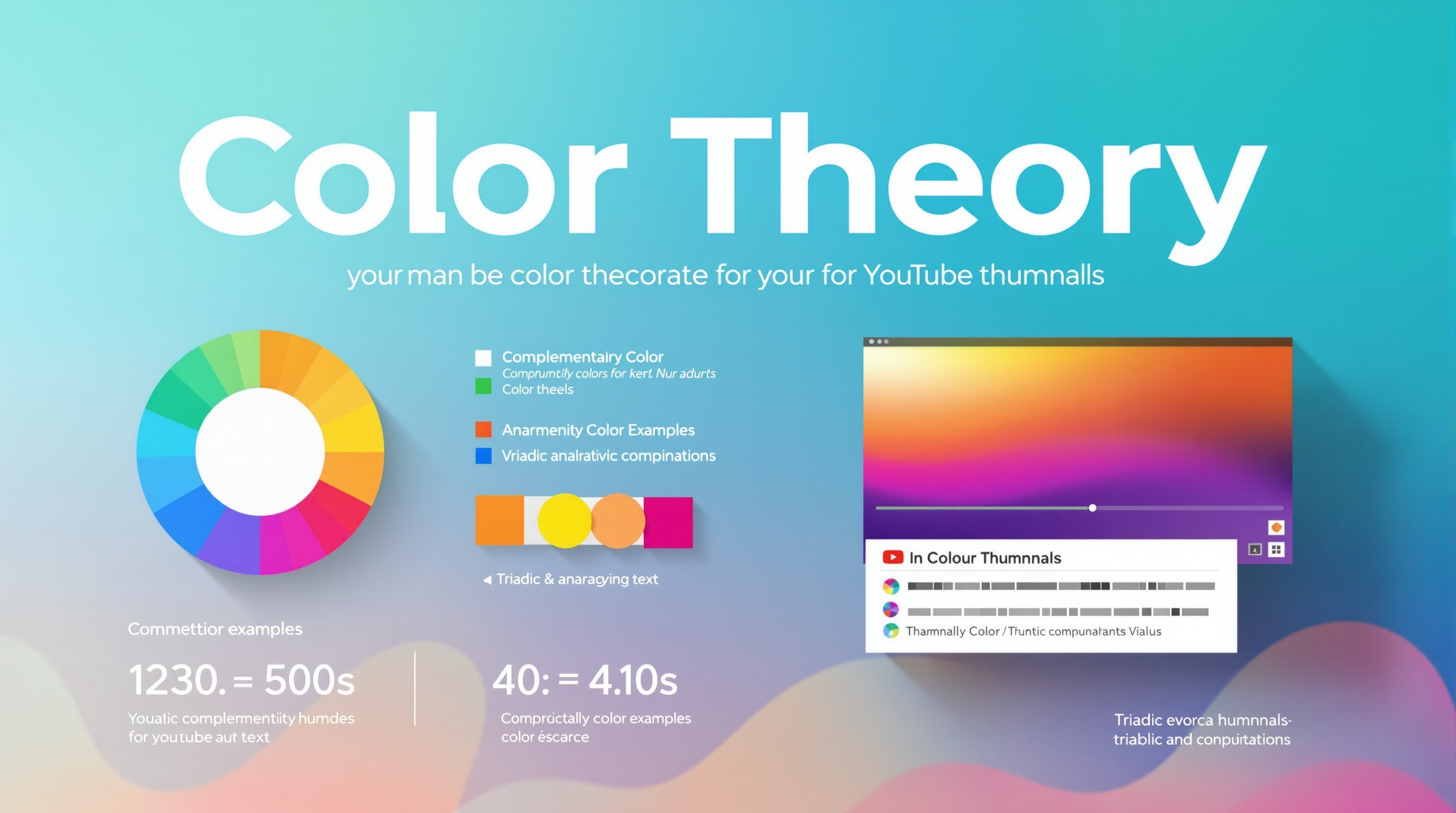
1. Complementary Colors
Colors opposite each other on the color wheel create the highest contrast and visual impact. This combination naturally draws the eye and creates vibrant, energetic thumbnails.
🎨 Top Complementary Pairs for YouTube:
Blue & Orange: Most popular combination on YouTube. Creates trust + enthusiasm.
Red & Green: High energy contrast, great for gaming and action content.
Purple & Yellow: Creative and attention-grabbing, perfect for artistic content.
Pink & Green: Unique combination that stands out in crowded niches.
2. Triadic Color Schemes
Using three colors equally spaced on the color wheel creates vibrant, balanced thumbnails while maintaining harmony. This technique works exceptionally well for complex thumbnails with multiple elements.
3. Analogous Colors
Colors next to each other on the color wheel create pleasing, harmonious combinations. While less contrasting than complementary schemes, analogous colors convey cohesion and sophistication.
4. Monochromatic with Accent
Using different shades and tints of one color creates a cohesive look, then adding one contrasting accent color creates a focal point. This approach works brilliantly for clean, professional thumbnails.
5. The 60-30-10 Rule
Distribute your colors with 60% dominant color (usually background), 30% secondary color (main elements), and 10% accent color (highlights and calls-to-action). This creates visual balance and prevents overwhelming the viewer.
Niche-Specific Color Strategies
🎮 Gaming Content
- Primary: Electric blues, neon greens, bright reds
- Why: High energy, competitive feel
- Avoid: Pastels, muted tones
- Pro tip: Use game-specific brand colors when relevant
📚 Educational Content
- Primary: Blues, greens, clean whites
- Why: Conveys trust, knowledge, clarity
- Accent: Bright orange or red for important elements
- Pro tip: Use darker blues for serious topics, lighter for casual
🍳 Food & Lifestyle
- Primary: Warm oranges, rich reds, golden yellows
- Why: Appetizing, warm, inviting
- Supporting: Natural greens, creamy whites
- Pro tip: Match colors to food being featured
💼 Business & Finance
- Primary: Navy blues, dark greens, professional grays
- Why: Trust, stability, expertise
- Accent: Gold or bright green for success/money themes
- Pro tip: Avoid overly bright colors that seem unprofessional
Advanced Color Techniques
Color Temperature Mixing
Combining warm and cool colors creates dynamic tension that draws attention. Use warm colors for subjects you want to emphasize and cool colors for backgrounds or supporting elements.
Saturation Strategy
High saturation colors grab attention but can be overwhelming. Use highly saturated colors sparingly for key elements, and balance with more muted tones. This creates visual hierarchy without chaos.
Cultural Color Considerations
Colors have different meanings across cultures. If your audience is global, research color associations in your primary markets. For example, red means luck in China but danger in Western cultures.
✅ Color Accessibility Checklist:
- • Ensure sufficient contrast between text and background (4.5:1 minimum)
- • Don't rely on color alone to convey information
- • Test thumbnails for color blindness using online tools
- • Consider how colors appear on different devices and lighting conditions
Tools for Color Selection
Free Color Tools:
- • Adobe Color (color.adobe.com) - Color wheel and scheme generator
- • Coolors.co - Palette generator and trending colors
- • Paletton.com - Advanced color scheme designer
- • WebAIM Contrast Checker - Accessibility testing
Browser Extensions:
- • ColorZilla - Pick colors from any webpage
- • Eye Dropper - Extract colors from images
- • Stark - Contrast and accessibility checker
- • Palette Creator - Generate palettes from images
Ready to Optimize Your Colors?
Put color theory into practice with our advanced thumbnail tools. Generate color-optimized thumbnails or analyze your existing ones for color psychology impact.
Testing and Optimization
Color theory provides the foundation, but testing reveals what actually works for your specific audience. Here's how to systematically test and optimize your color choices:
A/B Testing Color Strategy:
- 1. Baseline Measurement: Track CTR of your current thumbnails for 1-2 weeks
- 2. Single Variable Testing: Change only color scheme, keep everything else identical
- 3. Statistical Significance: Test for at least 1000 impressions per variant
- 4. Document Results: Track which colors perform best for different content types
- 5. Iterate: Apply winning colors to future thumbnails and continue testing
Common Color Mistakes to Avoid
❌ What NOT to Do:
- • Using too many colors (more than 4-5)
- • Low contrast between text and background
- • Following trends that don't match your content
- • Ignoring mobile visibility
- • Using colors that clash with your brand
✅ Best Practices:
- • Stick to 2-3 main colors plus neutrals
- • Ensure high contrast for readability
- • Choose colors that support your content message
- • Test thumbnails at small sizes
- • Maintain consistency across your channel
Key Takeaways
- Color psychology directly influences viewer emotions and click-through rates
- Complementary colors create the highest visual impact and attention
- Different content niches require different color strategies
- The 60-30-10 rule creates balanced, professional-looking thumbnails
- Always test color choices with your specific audience
- Accessibility matters – ensure sufficient contrast for all viewers
- Consistency in color choices builds brand recognition over time
Mastering color theory for YouTube thumbnails is a journey, not a destination. Start with the fundamentals, test systematically, and pay attention to what resonates with your audience. Remember, the best color scheme is one that not only looks appealing but also accurately represents your content and connects with your viewers emotionally.
About the Author
Sarah Johnson is a visual design expert with over 8 years of experience in digital marketing and color psychology. She has helped numerous YouTubers and content creators optimize their visual branding for maximum engagement and has spoken at several design conferences about the intersection of psychology and digital design.
Related Articles
10 Psychological Triggers That Make Thumbnails Irresistible
Discover the science behind what makes people click on thumbnails.
Mobile-First Thumbnail Design: What 70% of Creators Get Wrong
Learn how to design thumbnails that work perfectly on small screens.