The Mobile Crisis
Picture this: You spend hours perfecting a thumbnail that looks stunning on your desktop monitor. You upload it, excited to see the results. But something's wrong – your click-through rate is mysteriously lower than expected, and you can't figure out why.
The answer is simpler than you think: Your thumbnail looks great on desktop, but it's virtually invisible on mobile devices where most of your audience is watching. This single oversight is costing creators millions of views every day.
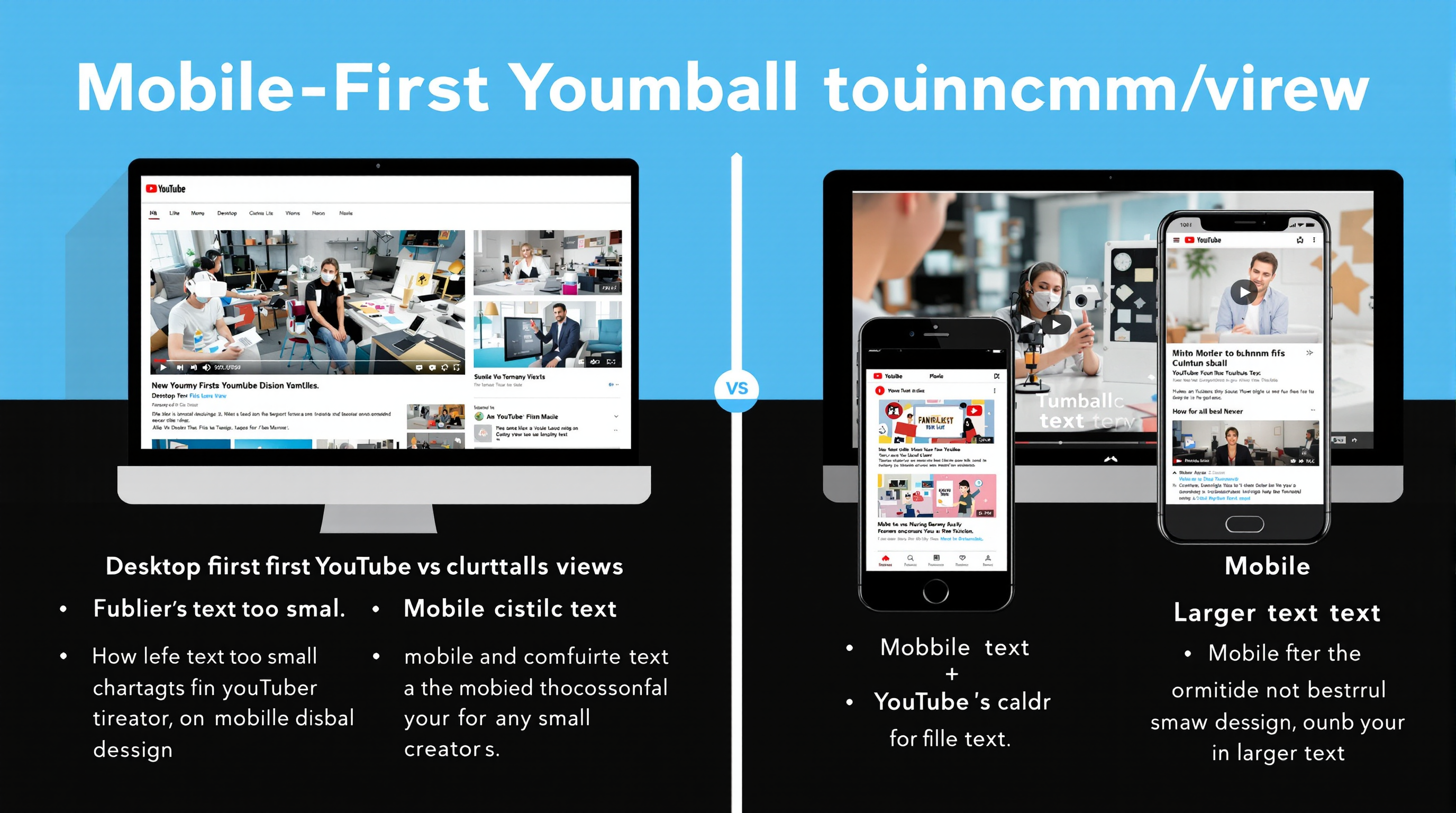
The Desktop vs Mobile Reality
Most creators design thumbnails while staring at large desktop screens, never seeing how their work translates to mobile devices. The result? Thumbnails optimized for an environment where only 30% of viewers actually watch.
Desktop Viewing (30% of traffic)
- • Thumbnail size: ~210x118 pixels in suggestions
- • Viewing distance: 18-24 inches from screen
- • Text readability: 12px+ fonts are readable
- • Fine details: Visible and impactful
- • Color subtleties: Rich gradients and nuances show well
- • Composition: Complex layouts work fine
💡 Reality Check:
On mobile, your thumbnail is roughly the size of a postage stamp. If someone can't understand what your video is about from 10 feet away in 2 seconds, you've lost them.
Test Mobile Readability Now!
Upload your thumbnails and instantly see how they appear on different mobile devices. Get readability scores and optimization suggestions.
Check Mobile PerformanceThe 7 Critical Mobile-First Rules
1. The 3-Second Clarity Test
Your thumbnail must communicate its core message within 3 seconds of viewing on a mobile device. If it takes longer, viewers scroll past.
✅ 3-Second Test Checklist:
- • Main subject is immediately recognizable
- • Text (if any) is instantly readable
- • Core emotion/message is crystal clear
- • No competing visual elements
- • High contrast makes everything pop
2. The Giant Text Rule
If your thumbnail includes text, it needs to be HUGE. What looks oversized on desktop is just right on mobile.
❌ Desktop Mindset:
- • 14-18px text (unreadable on mobile)
- • Multiple lines of text
- • Fancy, thin fonts
- • Text as supporting element
✅ Mobile-First:
- • 28px+ text minimum (bigger is better)
- • 3-4 words maximum
- • Bold, thick fonts
- • Text as primary element
3. The Single Focus Principle
Desktop thumbnails can handle complex compositions. Mobile thumbnails cannot. One clear subject, one clear message, period.
One Main Subject
Person, object, or scene that dominates 60%+ of the frame
One Clear Message
Emotion, action, or promise that's immediately obvious
One Dominant Color
Background or theme that unifies the entire composition
4. High Contrast is Everything
Mobile screens are viewed in all lighting conditions – bright sunlight, dim rooms, moving vehicles. Only high contrast cuts through these challenges.
Readable in any lighting
Sometimes readable
Often invisible
5. The Thumb-Stopping Rule
Mobile users scroll with their thumb. Your thumbnail needs to create a physical "stop" reaction. Bright colors, shocked faces, and unexpected elements work best.
6. Extreme Close-ups Win
What looks too close on desktop is perfect on mobile. Crop tighter than feels comfortable. Fill the entire frame with your subject.
📱 Mobile Cropping Guidelines:
- Faces: Crop from mid-chest up, eyes in top third
- Objects: Fill 70%+ of frame, minimal background
- Text: Edge-to-edge when possible, high contrast background
- Actions: Focus on the specific moment, eliminate everything else
7. Test Before Publishing
Never publish a thumbnail without seeing how it looks on an actual mobile device. What seems obvious on your computer screen might be invisible on a phone.
Mobile-First Design Process
Flip your design process. Start with mobile, then adapt for desktop:
Design at Mobile Size
Create your thumbnail at 480x270px, then scale down to 120x68px
Test Readability
View on actual mobile device or mobile simulator
Optimize for Impact
Increase contrast, simplify composition, enlarge key elements
Scale Up for Desktop
Ensure the mobile-optimized design still works at larger sizes
Mobile-First Optimization Tools
Use our mobile preview tools to see exactly how your thumbnails appear on different devices. Get instant feedback on readability, contrast, and mobile performance.
Common Mobile Mistakes
The "Looks Great on My Laptop" Trap
70% of creators design exclusively on large screens, never testing mobile appearance until it's too late.
Symptoms:
- • Mysteriously low CTR despite "good" thumbnails
- • Desktop views outperform mobile dramatically
- • Comments about thumbnails being "hard to see"
- • Competitors with "uglier" thumbnails getting more views
Mobile Testing Tools
Free Testing Methods
- • Phone Preview: Text yourself the thumbnail
- • Browser DevTools: Mobile device simulation
- • YouTube Mobile App: Upload and check suggestions
- • Distance Test: View from 10 feet away
- • Squint Test: If you can't see it squinting, it's too small
Advanced Testing Tools
- • BrowserStack: Real device testing
- • Responsively: Multi-device preview
- • Adobe XD: Device-specific artboards
- • Figma: Mobile frame testing
- • ThumbnailTest: A/B test mobile performance
Key Takeaways
- 70% of YouTube traffic is mobile – design for mobile first, always
- Thumbnails must pass the 3-second clarity test on small screens
- Text needs to be dramatically larger than you think (28px minimum)
- High contrast is the difference between visible and invisible
- Extreme close-ups and single focus points work best on mobile
- Never publish without testing on actual mobile devices
- Start your design process at mobile size, then scale up
The mobile-first approach isn't just about technical optimization – it's about respecting where your audience actually watches your content. When you design for mobile first, you're designing for the majority of your viewers, not the minority.
Make this shift today. Your click-through rates, view counts, and subscriber growth will thank you. The creators who understand this principle are already leaving their desktop-focused competitors behind.
About the Author
Emma Wilson is a mobile UX specialist who has optimized thumbnails and digital content for over 300 creators and brands. With expertise in mobile design psychology and user behavior analysis, Emma helps content creators bridge the gap between desktop creation and mobile consumption. Her mobile-first optimization strategies have generated over 25 million additional mobile views for her clients.
Related Articles
The Ultimate Guide to Color Theory for YouTube Thumbnails
Learn how color combinations affect viewer emotions and mobile visibility.
5 Data-Driven Strategies to Increase Your CTR by 300%
Real case studies from creators who dramatically improved their performance.