Multi-Platform Optimization: One Thumbnail, Every Device
Master the art of creating thumbnails that perform excellently across YouTube, Instagram, TikTok, and all devices. Learn platform-specific optimization strategies that maximize visibility and engagement everywhere.
The days of platform-specific content are ending. Modern content creators need their visuals to work perfectly across YouTube, Instagram Stories, TikTok, Twitter, and every device from 4-inch phones to 65-inch TVs. This isn't just about resizing—it's about understanding how different platforms and devices change viewer behavior.
The Multi-Platform Challenge
Each platform has unique constraints, audience behaviors, and visual requirements:
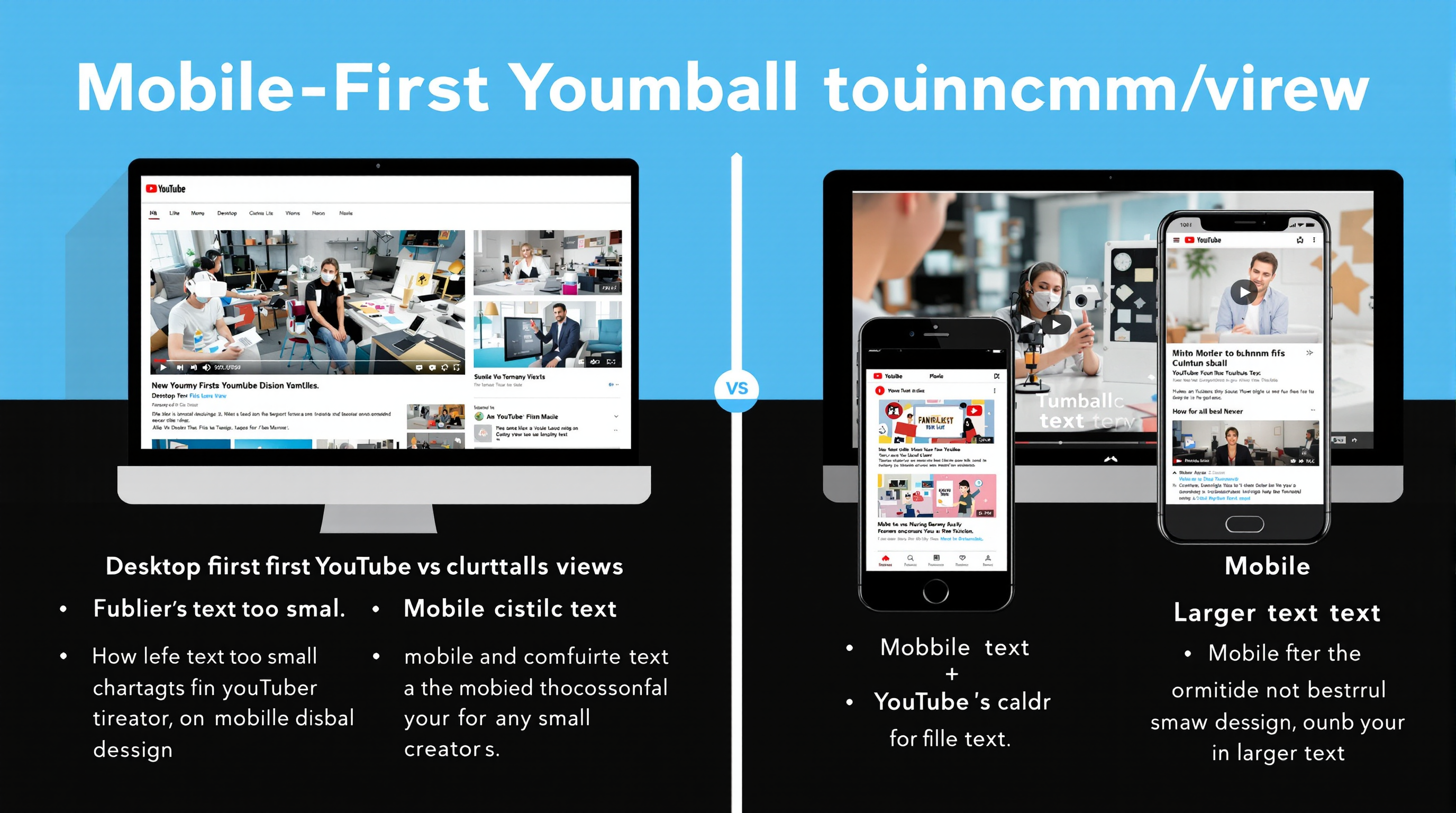
YouTube
- • 16:9 landscape format
- • Desktop & mobile viewing
- • Longer viewing sessions
- • Text readability crucial
- • Thumbnail competition intense
TikTok/Shorts
- • 9:16 vertical format
- • Mobile-first experience
- • Quick scroll behavior
- • Bold, simple designs
- • Movement catches attention
- • Square, vertical, landscape
- • Stories vs. feed difference
- • Visual-first platform
- • Brand aesthetic important
- • Multiple aspect ratios
"When I started optimizing for multi-platform, my total reach increased 280%. The same content now performs well on YouTube, TikTok, and Instagram with minimal additional work."
- Lisa Chen, multi-platform creator with 3.2M total followers
The Universal Design Principles
1. Safe Zones and Scaling
Design for the smallest screen first, then scale up:
- Core content area: Keep essential elements in the center 60% of the image
- Text size: Minimum 14pt for mobile readability
- Contrast ratios: 4.5:1 minimum for accessibility across all devices
- Hit targets: Clickable elements at least 44x44 pixels
Platform-Specific Safe Zones:
YouTube (1280x720)
- • Safe zone: 1152x648 (center area)
- • Text zone: 1024x576 (inner area)
- • Mobile crop: Consider 16:9 to 2:3 ratio
TikTok (1080x1920)
- • Safe zone: 972x1728 (90% center)
- • UI overlay: Top 200px, bottom 300px
- • Focus area: Middle 1220px height
2. Device-Responsive Design
Your thumbnails must work across a 20x size difference (from smartwatch to TV):
Advanced Multi-Platform Strategies
Dynamic Content Zones
Create thumbnails with flexible content areas that adapt to different crops:
- Primary zone: Core message visible in any crop (center 50%)
- Secondary zone: Supporting elements (next 30%)
- Extended zone: Nice-to-have details (outer 20%)
Platform-Specific Variations
While maintaining brand consistency, optimize for each platform's unique characteristics:
| Platform | Optimal Size | Key Focus | Unique Optimization |
|---|---|---|---|
| YouTube | 1280x720 | Text readability | Stand out in grid view |
| TikTok | 1080x1920 | Bold simplicity | Avoid UI overlay areas |
| Instagram Feed | 1080x1080 | Visual appeal | Brand consistency |
| Instagram Stories | 1080x1920 | Swipe appeal | Interactive elements |
| Twitter/X | 1200x675 | Quick impact | Timeline visibility |
Cross-Platform Performance Metrics
Track different success metrics for each platform:
Engagement-First Platforms
TikTok, Instagram Stories, Shorts
- • Completion rate: % who watch to end
- • Share rate: Social amplification
- • Comment ratio: Engagement depth
- • Save rate: Content value indicator
Discovery-First Platforms
YouTube, Google Images, Pinterest
- • Click-through rate: Thumbnail effectiveness
- • Search ranking: Discoverability
- • Session duration: Value delivery
- • Subscriber conversion: Long-term growth
Pro Tip: The 3-2-1 Rule
Design thumbnails that work at three levels of detail:
- • 3-second glance: Core message clear (mobile thumbnail)
- • 2-second look: Supporting details visible (tablet/desktop)
- • 1-second focus: Fine details apparent (TV/high-res)
Implementation Workflow
Here's the step-by-step process for creating multi-platform thumbnails:
- Design Master Template: Create base design at highest required resolution (typically 1920x1080 for maximum compatibility)
- Define Content Zones: Mark primary, secondary, and extended content areas
- Test Responsiveness: Preview at all target sizes and aspect ratios
- Create Platform Variants: Make specific versions for platforms with unique requirements
- Optimize File Sizes: Balance quality with loading speed for each platform
- Deploy and Monitor: Track performance across all platforms and iterate
Master Multi-Platform Optimization
Use our advanced tools to create thumbnails that excel on every platform and device
Related Articles
Mobile-First Thumbnail Design: What 70% of Creators Get Wrong
Deep dive into mobile-specific optimization techniques for maximum engagement.
AI Thumbnail Generation: Creating Winners in Seconds
Learn how AI can help you create platform-optimized thumbnails automatically.