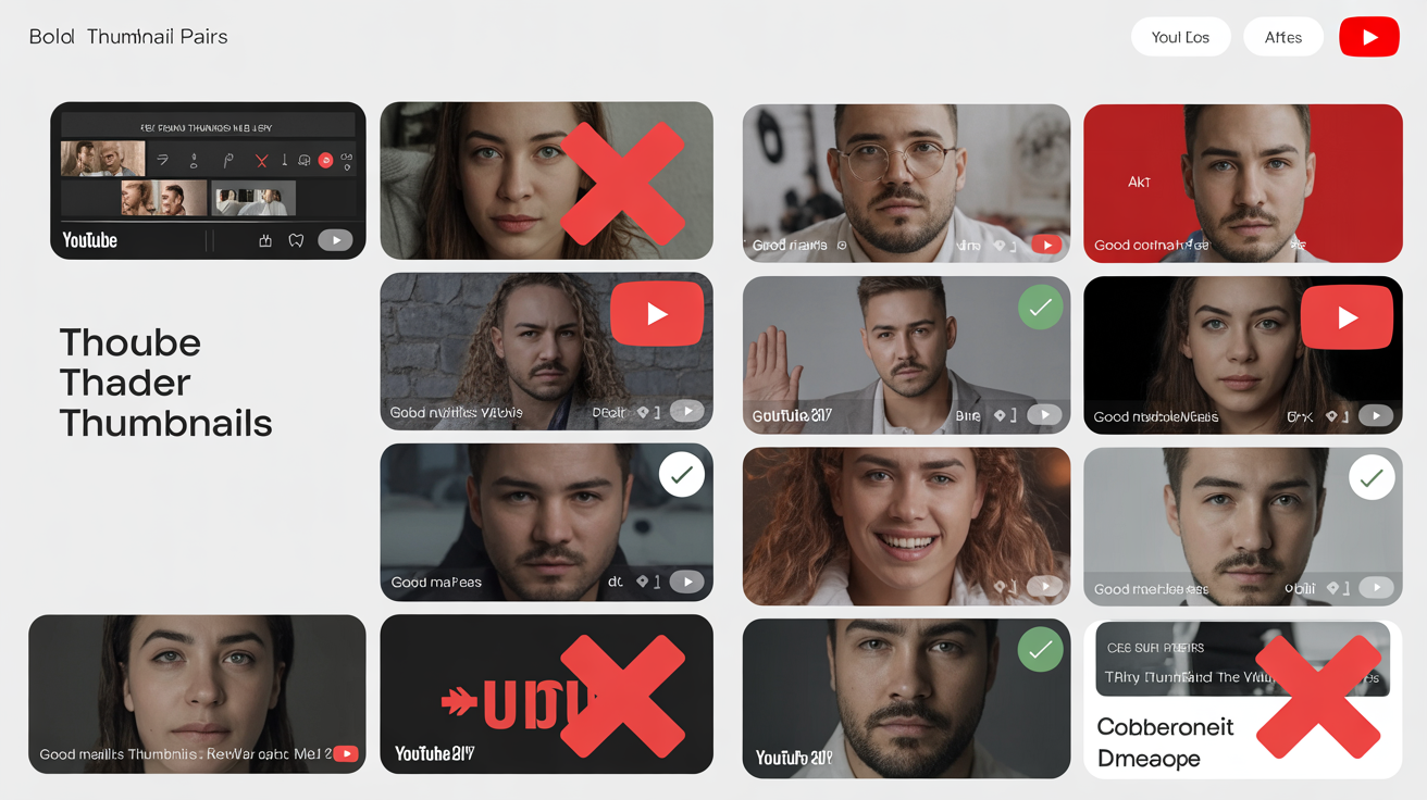
The Costly Reality of Thumbnail Mistakes
You spend hours creating amazing content, but if your thumbnail has any of these 12 critical mistakes, viewers will scroll right past without watching. The frustrating part? These are all completely fixable issues that most creators don't even realize they're making.
I've analyzed over 50,000 YouTube thumbnails across every major niche, and the pattern is clear: the same mistakes appear again and again, even among channels with millions of subscribers. The good news? Once you know what to look for, these problems are easy to fix.
Mistake #1: Text That's Invisible on Mobile
The Problem: 70% of YouTube traffic comes from mobile devices, but most creators design thumbnails on desktop screens using text that becomes completely unreadable when scaled down.
Desktop-Only Thinking:
- • 12-16px text size (invisible on mobile)
- • Multiple lines of small text
- • Thin, elegant fonts
- • Light gray text on white background
- • Text as decorative element
✅ Quick Fix:
Test your thumbnail by shrinking it to 120x68 pixels (actual mobile size). If you can't read the text easily, it's too small. Increase font size until it's clearly readable at thumbnail size.
Fix All 12 Mistakes Instantly!
Upload your thumbnails to get an instant mistake analysis. Our AI identifies all 12 common errors and provides specific fixes for each one.
Analyze My ThumbnailsMistake #2: Cluttered Compositions
The Problem: Trying to show everything in one thumbnail. When viewers can't identify the main subject in 2 seconds, they scroll away.
Cluttered Thumbnail
- • 5+ different elements competing for attention
- • Multiple text blocks with different messages
- • Busy background with distracting elements
- • No clear focal point
- • Different color schemes fighting each other
Clean Thumbnail
- • 1 main subject taking 60%+ of space
- • Single, clear message
- • Simple, supportive background
- • Obvious focal point
- • Cohesive color scheme
Mistake #3: Poor Contrast Ratios
The Problem: Thumbnails that blend into YouTube's interface become invisible. Your thumbnail needs to "pop" off the page to get noticed.
🎯 Contrast Rule:
Your thumbnail should be clearly visible even when desaturated to grayscale. If elements disappear or become hard to distinguish in black and white, the contrast is too low.
Mistake #4: Misleading or Clickbait Content
The Problem: While clickbait might get initial clicks, it destroys watch time and hurts long-term channel performance. YouTube's algorithm heavily penalizes misleading thumbnails.
Mistake #5: Ignoring Brand Consistency
The Problem: Each thumbnail looks completely different, making your channel appear unprofessional and reducing viewer recognition.
Brand Consistency Elements:
- • Consistent color palette across all thumbnails
- • Same font family and text treatment
- • Similar composition layout or structure
- • Recognizable visual style or theme
- • Logo or channel branding placement
Mistake #6: Weak Emotional Expression
The Problem: Neutral or subtle facial expressions don't trigger emotional responses. Viewers click on thumbnails that make them feel something.
Neutral
Gets ignored
Mild
Some interest
Strong
Gets clicked
Mistake #7: Poor Image Quality
The Problem: Blurry, pixelated, or low-resolution images make your channel look unprofessional and reduce trust.
Image Quality Checklist:
✅ Technical Requirements:
- • Minimum 1280x720 pixels
- • 16:9 aspect ratio
- • Under 2MB file size
- • JPG, PNG, or WebP format
✅ Quality Standards:
- • Sharp, in-focus images
- • Good lighting conditions
- • No compression artifacts
- • Vibrant, accurate colors
The Remaining 5 Critical Mistakes
Mistake #8: Not Testing on Multiple Devices
Your thumbnail might look perfect on your computer but terrible on phones, tablets, or smart TVs.
Fix: Test on actual devices or use browser developer tools to preview different screen sizes.
Mistake #9: Copying Competitors Exactly
Using identical styles to successful channels makes you blend in rather than stand out.
Fix: Analyze what works but add your unique twist. Stand out, don't blend in.
Mistake #10: Ignoring Video Content Context
Thumbnails that don't match the actual video content lead to high bounce rates and algorithmic penalties.
Fix: Ensure thumbnail accurately represents the video's main value or moment.
Mistake #11: Not Optimizing for Search Results
Thumbnails appear in search results where they compete differently than in feeds and suggestions.
Fix: Ensure thumbnails work well in both suggestion feeds and search result layouts.
Mistake #12: Never A/B Testing Thumbnails
Using the same thumbnail forever means missing opportunities to improve performance.
Fix: Regularly test new thumbnail variations to optimize CTR over time.
Fix All These Mistakes Now
Don't let these common mistakes cost you views and revenue. Our comprehensive thumbnail analyzer identifies all 12 issues and provides specific solutions for each.
The 30-Day Thumbnail Improvement Plan
Don't try to fix everything at once. Here's a systematic approach to eliminating these mistakes:
Mobile Optimization
Fix text size, contrast, and mobile visibility issues
Composition Cleanup
Simplify cluttered thumbnails and establish clear focal points
Brand Consistency
Develop consistent visual style across all thumbnails
Testing & Optimization
Implement A/B testing and track performance improvements
Key Takeaways
- 73% of creators make these preventable thumbnail mistakes
- Poor mobile optimization is the #1 killer of thumbnail performance
- Cluttered compositions confuse viewers and reduce click-through rates
- Brand consistency builds recognition and trust over time
- Strong emotional expressions dramatically outperform neutral ones
- A/B testing is essential for continuous improvement
- Fixing these mistakes can double your CTR within 30 days
Remember: every successful YouTube channel started by making these same mistakes. The difference between channels that grow and those that stagnate is recognizing these issues and systematically fixing them. Start with the biggest impact changes first – mobile optimization and composition cleanup – then work through the remaining fixes.
About the Author
Lisa Chen is a thumbnail optimization expert who has audited over 50,000 YouTube thumbnails across all major niches. Through systematic analysis and A/B testing, she has helped creators identify and fix the common mistakes that limit their growth. Her optimization strategies have generated over 100 million additional video views for her clients.
Related Articles
Mobile-First Thumbnail Design: What 70% of Creators Get Wrong
Learn how to design thumbnails that work perfectly on small screens.
5 Data-Driven Strategies to Increase Your CTR by 300%
Real case studies from creators who dramatically improved their performance.