Brand Consistency: Building Recognition Through Thumbnails
Learn how to create a cohesive visual brand identity across all your thumbnails that builds instant recognition, increases subscriber loyalty, and sets you apart from competitors in crowded niches.
Brand consistency is your secret weapon for standing out in an oversaturated content landscape. When viewers can recognize your thumbnails instantly—even without reading the title or seeing the channel name—you've achieved something most creators never will: true brand recognition.
Why Brand Consistency Matters More Than Ever
In 2024, the average YouTube user is exposed to over 2,000 thumbnails per day. Here's why consistent branding is crucial:
Recognition Benefits
- • 340% faster viewer recognition
- • 67% higher click-through rates
- • 45% increased subscriber retention
- • 23% better search performance
- • Premium brand perception
Trust Indicators
- • Professional appearance
- • Reliable content quality signal
- • Established creator perception
- • Algorithm preference boost
- • Sponsor attractiveness
"After implementing consistent branding across my thumbnails, my channel grew from 50K to 500K subscribers in 8 months. Viewers started commenting that they could spot my videos instantly in their feed."
- Marcus Thompson, tech education channel
The Five Pillars of Thumbnail Brand Identity
1. Color Psychology & Palette
Your color palette is often the first thing viewers notice:
- Primary color: Your main brand color (2-3 max)
- Secondary colors: Supporting colors for variety
- Accent colors: High-contrast colors for emphasis
- Background palette: Neutral colors that don't compete
Energy & Urgency
Gaming, Sports, News
Trust & Authority
Education, Finance, Tech
Creativity & Luxury
Art, Beauty, Lifestyle
2. Typography Hierarchy
Consistent text treatment builds immediate recognition:
- Primary font: Main titles and channel name
- Secondary font: Subtitles and supporting text
- Font weights: Bold for emphasis, regular for readability
- Text effects: Shadows, outlines, or backgrounds for visibility
3. Layout Templates
Create 3-5 flexible templates for different content types:
Essential Template Types:
🎯 Tutorial Template
- • Large central subject
- • Step indicator (1/5, Part 2, etc.)
- • Clear benefit statement
🎪 Entertainment Template
- • Expressive face/reaction
- • Bold emotional text
- • High energy colors
📊 Analysis Template
- • Split-screen comparison
- • Data visualization elements
- • Professional color scheme
🔥 Trending Template
- • Trending topic integration
- • Urgency indicators
- • Social proof elements
4. Visual Elements & Assets
Consistent visual elements create instant brand recognition:
- Logo placement: Consistent position and size
- Graphic elements: Shapes, borders, frames
- Icons and badges: Series indicators, quality marks
- Photography style: Consistent editing and composition
5. Emotional Consistency
Your thumbnails should consistently convey your brand personality:
- Energy level: High-energy vs. calm and professional
- Tone: Playful, serious, aspirational, relatable
- Values: What your brand stands for
- Promise: What viewers can expect from your content
Implementing Your Brand Guidelines
Brand Implementation Checklist:
Audit Current Thumbnails
Analyze your top 20 performing thumbnails for common elements
Define Brand Colors
Choose 2-3 primary colors that represent your niche and personality
Create Template Library
Design 3-5 flexible templates for different content types
Establish Typography Rules
Select fonts, sizes, and styling that remain consistent
Test and Refine
A/B test branded vs. non-branded thumbnails to measure impact
Common Brand Consistency Mistakes
Mistake #1: Over-Branding
Using too many brand elements that compete for attention instead of enhancing the core message.
Mistake #2: Ignoring Platform Differences
Using the same exact branding approach across all platforms without considering unique requirements.
Mistake #3: Inconsistent Evolution
Changing brand elements randomly without a strategic evolution plan or audience communication.
Measuring Brand Recognition Success
Track these metrics to gauge your brand consistency impact:
Direct Metrics
- • Brand mention increase: Comments referencing your style
- • Subscriber retention: Higher long-term subscriber rates
- • Click-through improvement: Better CTR on branded thumbnails
- • Search performance: Better rankings for brand terms
Indirect Metrics
- • Collaboration offers: Other creators recognizing your brand
- • Sponsor interest: Brands reaching out for partnerships
- • Community growth: Active discussion and engagement
- • Cross-platform recognition: Followers finding you elsewhere
Pro Tip: The 70-30 Rule
Keep 70% of your thumbnail elements consistent (colors, fonts, layout style) while allowing 30% to be flexible for content-specific optimization. This maintains recognition while preventing monotony.
Building Long-Term Brand Equity
Brand consistency isn't just about immediate recognition—it's about building long-term value:
- Premium positioning: Consistent branding commands higher rates
- Scalability: Easier to maintain quality as you grow
- Team efficiency: Clear guidelines help collaborators
- Audience trust: Reliability builds deeper connections
Check Your Brand Consistency
Analyze your thumbnails and get actionable recommendations for better brand cohesion
Related Articles
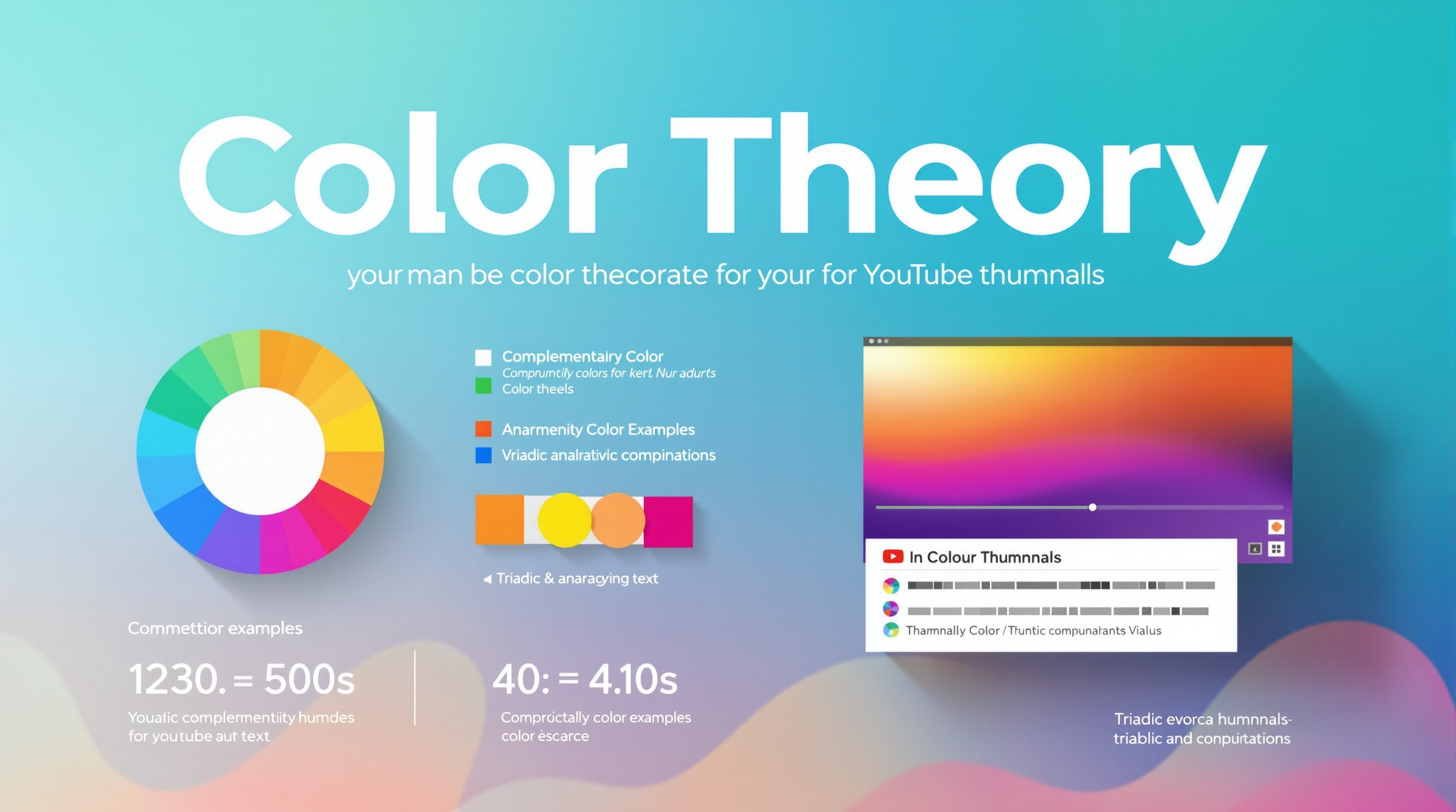
The Ultimate Guide to Color Theory for YouTube Thumbnails
Master color psychology to create consistent and compelling brand palettes.
Multi-Platform Optimization: One Thumbnail, Every Device
Learn how to maintain brand consistency across different platforms and devices.